Making Responsive Tables Work in Technical Manuals: A Practical Guide for Shop Owners
- Responsive tables adapt to different screen sizes, preventing data from getting cut off or hidden on mobile devices.
- Column management features (freeze, hide, reorder) dramatically improve usability in technical documentation.
- Proper localization of numbers, units, and measurements is critical when selling to international customers.
- Stacking or collapsing table layouts on mobile prevents horizontal scrolling frustrations.
- Interactive features like filters and export options help customers find the specs they need quickly.
Why Table Layout Matters More Than You Think

I learned this lesson the hard way a few years back. We had a beautiful product manual for industrial mixers—everything looked perfect on desktop. Then a customer called from a warehouse, frustrated because he couldn't see the voltage specifications on his tablet. Half the table was just... gone. Cut off. He nearly returned a $3,000 unit because he thought we'd sent the wrong model.
Table formatting isn't just about aesthetics; it's about usability and trust. Responsive tables adjust their layout based on screen size. Modern approaches reformat tables at critical breakpoints so they work on desktops, tablets, and phones without losing critical data. Columns can stack vertically, collapse into cards, or allow swiping to reveal hidden information—anything to avoid the horizontal scroll that frustrates users.
For shop owners selling appliances internationally, documentation must serve a technician on a phone, a buyer on a laptop, and a warehouse manager on a tablet. If your tables don't adapt, you're telling some portion of your customers "good luck figuring this out."
Collapsed vs. Stackable: Choosing Your Mobile Strategy
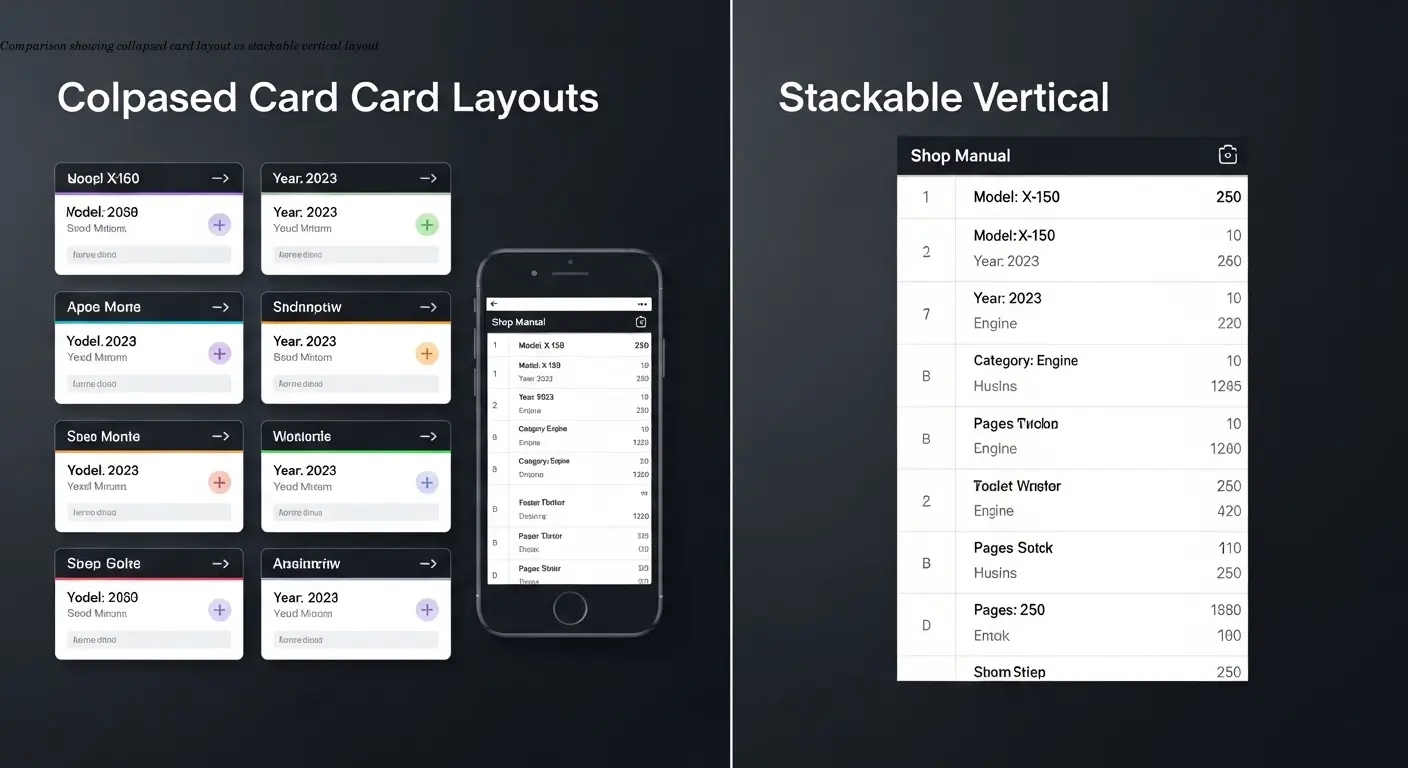
There are two main schools of thought for small screens, and I've used both depending on the situation.
- Collapsed tables turn each row into a card-like layout on mobile, showing the most important info upfront and hiding secondary details. Ideal when users look up one product at a time.
- Stackable tables stack columns vertically so everything remains visible in a different arrangement. Better when customers need to compare multiple values across products.
- Swipeable columns are a middle ground—maintain table structure and allow horizontal discovery without forcing the layout to break.
Ask: what's the one piece of info someone needs to see first? That becomes your frozen or primary column that never moves.
Column Management: Give Users Control
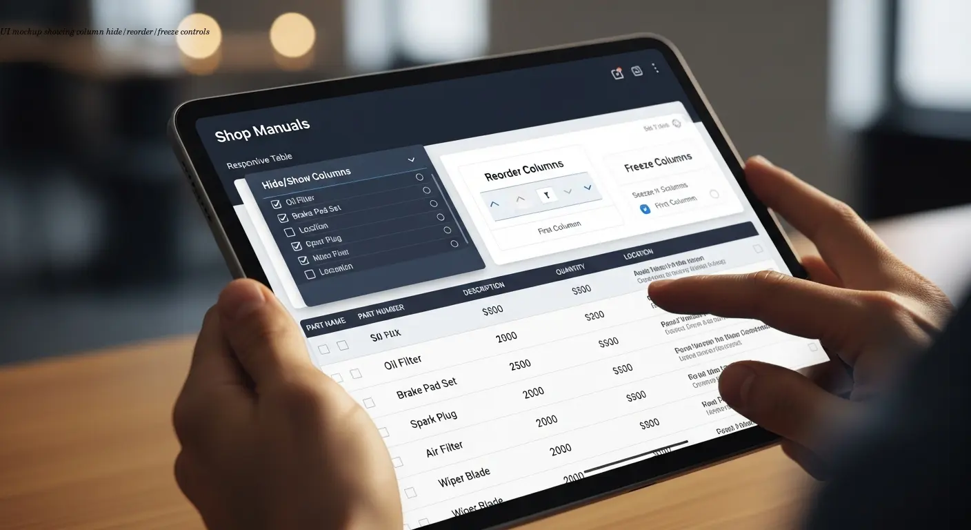
Letting users customize which columns they see actually reduces support tickets. We implemented add/remove/reorder functionality in our equipment catalogs, and customer questions about "where do I find the amp rating" dropped by almost 40%. People could hide columns they didn't care about and focus on what's relevant.
Freezing columns keeps the product name or model number visible while other columns scroll—this preserves context and reduces confusion.
The customization also reduces cognitive load. A purchasing manager cares about price and lead time; a technician needs voltage, amperage, and dimensions. One table, multiple views. For different markets, you can provide presets—e.g., hide imperial units for European buyers.
Solving Scrolling Problems Without Breaking Everything
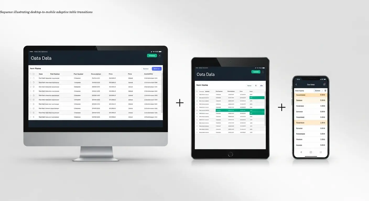
Forced horizontal scrolling on mobile is one of the worst UX problems. Users lose their place, miss important info, or give up. The solution is adaptive layouts: show all columns on desktop, collapse some on tablet, and switch to stack or card on phone.
Row and column freeze features help with large tables—freeze headers and the first column so navigation remains possible. Filters let users narrow results by voltage, capacity, or price instead of scrolling through dozens of rows.
I've seen massive comparison charts that are comprehensive but unusable because nothing stays in context. Add freeze, filters, and progressive disclosure so the table becomes navigable instead of overwhelming.
Measurement Localization: Numbers That Actually Make Sense
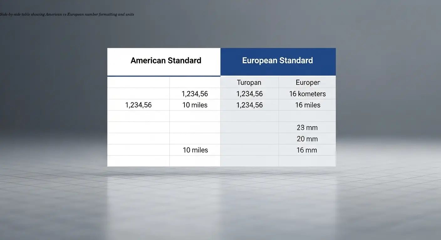
This is where shops most often fail for international sales. I once received a manual listing dishwasher water consumption as "2.5 gallons/cycle" for European markets—where liters are standard—and the conversion was wrong. Small mistakes like that make the entire manual feel untrustworthy.
Localization goes beyond language. Number formats differ (US: 1,234.56 vs many European locales: 1.234,56). Units, temperature scales, voltage, and frequency all vary. According to best practices from CSE Science Editor, standardize units and number formats per target locale, including proper decimal marks and digit grouping.
Maintain consistency across your product line—if one manual uses metric and another imperial for similar products, customers notice. Include a clear legend to explain units and conversions. Avoid ambiguous abbreviations (e.g., "m" could mean meters or minutes) by clarifying in a key.
Visual Consistency: Making Tables Professional
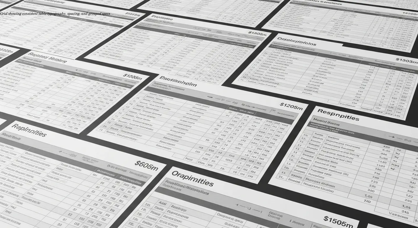
Ugly tables make your products look cheap. Consistent templates across documentation reinforce readability and brand professionalism.
- Use a typographic hierarchy: bold for product names, regular for specs, lighter color for notes.
- Keep spacing, borders, and labels uniform across manuals.
- Avoid heavy decoration—colorful backgrounds and fancy borders often harm readability.
If you have 40 specs, split them logically—electrical specs, physical dimensions, performance characteristics—or use progressive disclosure. White space is your friend; don't cram everything together for the sake of saving paper.
Interactive Features: Beyond Static Data
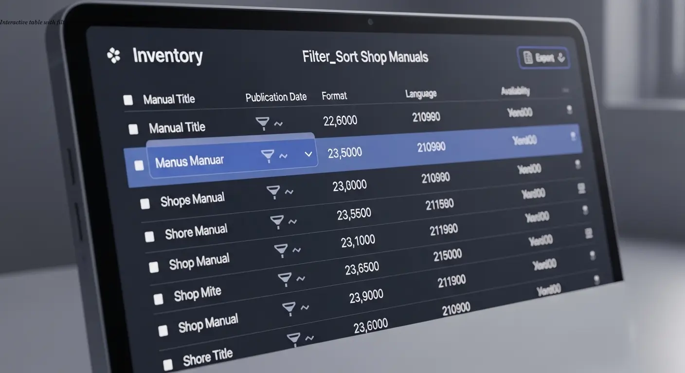
Modern documentation should be a tool. Edit and export functionality is invaluable—purchasing managers want to copy specs into spreadsheets or share them. Filters let users drill down by capacity range, voltage, or price. Sorting by column should be standard.
Bulk actions matter when presenting accessories or compatible parts—allow selection and export or add to a quote. Research from Denovers shows that filters and sorting dramatically improve usability; the technical implementation transforms a passive table into an active decision-making tool.
Accessibility and Translation Considerations
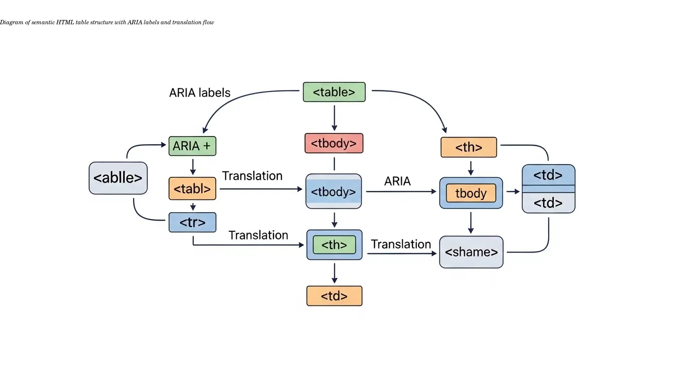
Proper HTML markup with semantic tags, headers, and descriptive labels helps screen readers and translation tools. Poorly structured tables often fall apart during translation because they relied on visual tricks rather than markup.
A well-structured responsive table will maintain its functionality whether displaying English or a right-to-left language like Arabic. Scribe's best practices emphasize semantic structure: headers, data cells, and descriptive labels help both assistive tech and translation workflows.
Consistent, semantic tables ensure the German manual looks as professional and functional as the English one—building trust with international customers.
FAQ