Making Responsive Tables Work in Technical Manuals: A Practical Guide for Shop Owners
Estimated reading time: 10 minutes
Key takeaways
- Responsive tables adapt automatically to different screen sizes, preventing broken layouts and frustrated customers reading your product manuals.
- Column visibility and overflow handling are critical — use media queries, collapsible sections, and expandable rows to manage wide tables on mobile devices.
- Measurement localization and number formatting must match your customer's region (decimal commas vs. points, metric vs. imperial units).
- Test across real devices using browser developer tools and actual phones/tablets to catch layout breaks before customers see them.
- Start with mobile-first and use semantic HTML (
<table>,<thead>,<tbody>) to improve accessibility and search understanding.
Table of contents
Why Responsive Tables Matter for Product Manuals

If you're selling appliances or technical equipment to customers across different regions, your product manuals need to work on every device. I learned this the hard way when customers couldn't read specification tables for industrial mixers on their phones — they saw a jumbled mess or endless horizontal scrolling. That friction kills comparison shopping and damages conversion.
Responsive tables reorganize themselves based on screen size so technical specifications, measurement charts, and troubleshooting guides remain readable whether someone's on a desktop in Germany or a smartphone in Japan. Poor table formatting directly impacts sales — customers who can't compare models or understand installation specs simply move to competitors with clearer documentation.
Modern customers expect documentation that just works: tablets in assembly, phones in showrooms, laptops at desks.
Core Principles for Building Robust Tables
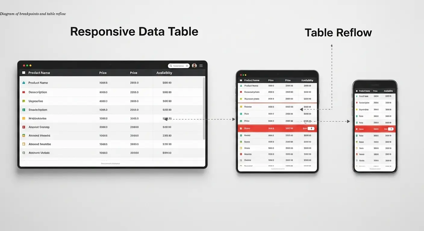
The foundation of good table formatting starts with responsiveness — your tables must adapt rather than break. Implement responsive frameworks with proper breakpoints to prevent most layout failures. Breakpoints are where the table changes behavior: hide less-important columns on phones, or stack information vertically.
Testing is non-negotiable. Use Chrome DevTools and Firefox Responsive Design Mode to simulate devices, but always test on real phones and tablets. Touch interactions differ from mouse clicks, and real devices expose edge cases simulators miss.
Use percentage-based or viewport-relative units (like vw or em) for column widths instead of fixed pixels. This avoids overflow and ensures columns expand and contract smoothly as screens change.
Preventing Broken Layouts and Scrolling Problems
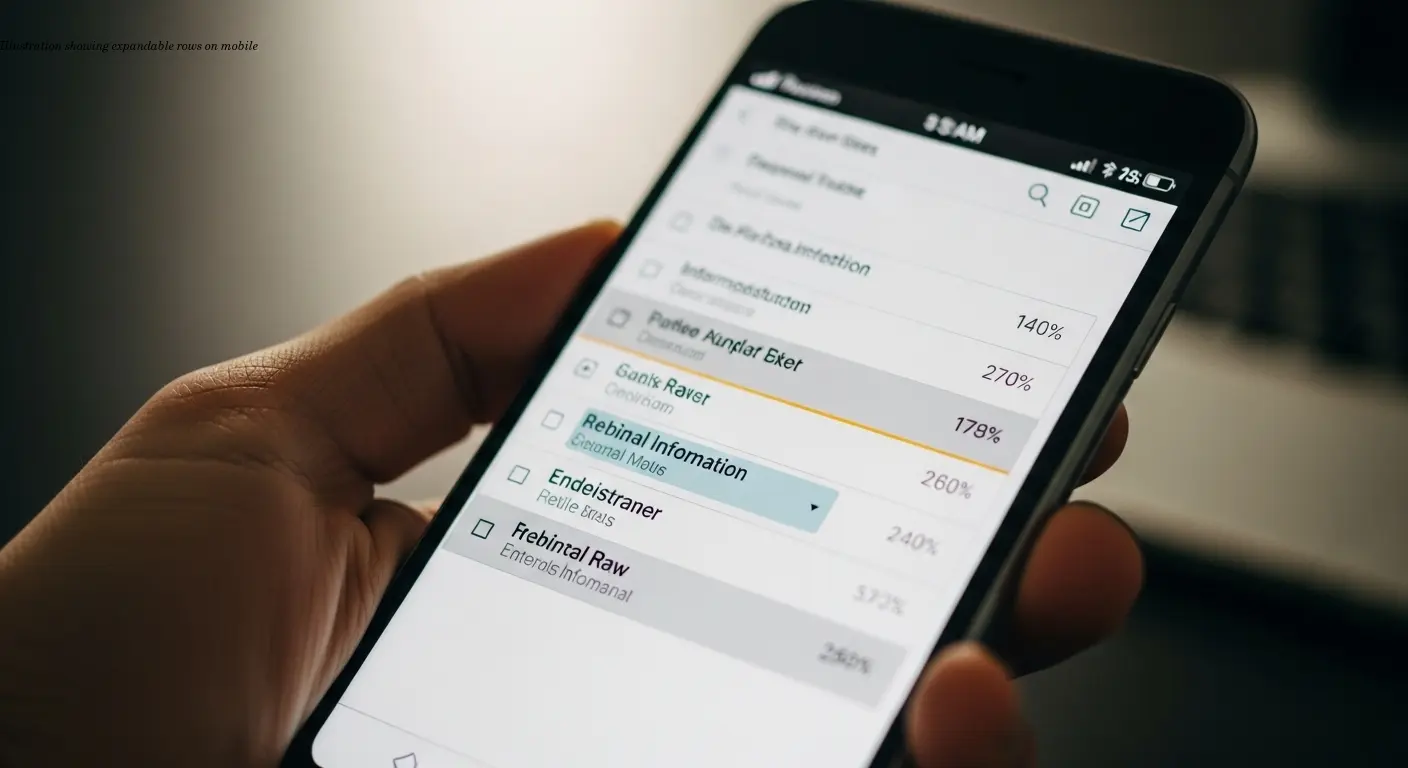
Horizontal scrolling is the enemy of good mobile documentation. Decide which columns are essential and which can be hidden or collapsed on smaller screens. For spec tables with many columns, implement expandable rows on mobile: show critical information (model, price, power rating) by default and reveal extra details on tap.
Use media queries to create custom breakpoints: show all columns on desktop (>1024px), hide secondary specs on tablets (768–1024px), and present only critical columns with expandable details on phones (<768px). This progressive disclosure matches real user behavior.
Prioritize overflow management: ask which columns customers absolutely need first. Move less-essential details to expandable sections or separate pages.
Handling Measurements and Localization Correctly
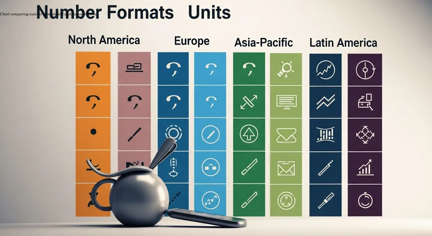
Number formatting and units vary dramatically by region. Europeans expect 1.500,99, Americans expect 1,500.99. Use tools like JavaScript's Intl.NumberFormat when your system supports them to handle locale-specific formatting.
Units need automatic conversion or dual-unit displays: inches vs. centimeters, pounds vs. kilograms. I worked with a distributor who initially shipped manuals with imperial-only measurements and lost European sales because customers couldn't easily interpret dimensions.
Right-to-left (RTL) language support must change table flow — Arabic and Hebrew require tables that read right-to-left with important columns on the right. This often requires HTML structure changes, not only CSS flips.
Accessibility and Semantic Structure

Use semantic HTML: <table>, <thead>, <tbody>, and <tfoot>. Include scope="col" and scope="row" on headers so assistive technologies correctly map headers to data cells.
Caption every table with a clear title (for example, "Table 3: Energy Consumption by Model") and number tables sequentially so customers can reference them easily.
Keyboard navigation is essential. Ensure users can tab through tables, expand collapsible sections, and activate sorting/filtering using Tab, Enter, and Arrow keys.
Advanced Techniques for Technical Documentation
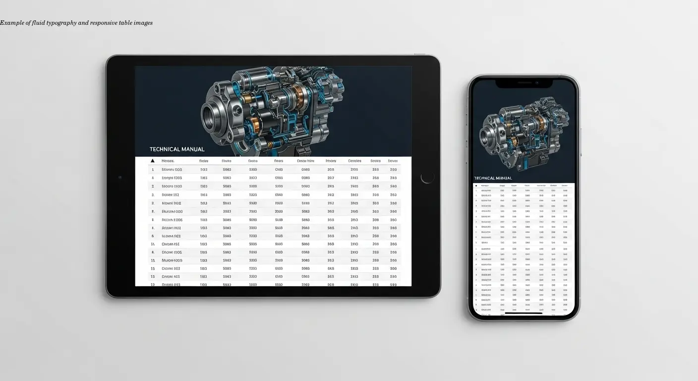
Use fluid typography (CSS clamp()) to set minimum, preferred, and maximum font sizes so numbers and codes remain legible across viewports. Constrain responsive images with object-fit and aspect-ratio to avoid layout breakage.
Consider established table libraries (DataTables, AG Grid) for built-in responsive behavior, accessibility, and sorting/filtering. They add complexity and weight, but often solve problems you would otherwise rebuild.
Adopt a mobile-first philosophy: design for the smallest screen first, then progressively enhance for larger screens.
Workflow for Creating Bulletproof Tables

Start by identifying essential columns. Prioritize ruthlessly: what does a customer need to make a purchase decision or install safely? Essential columns stay visible; secondary columns get hidden or collapsed on mobile.
Design in a mobile viewport first. If a spec table works on a 375px-wide phone, it will work on larger displays. Use device previews and real-device testing in both portrait and landscape to catch orientation-specific issues.
Use version control and iterate: collect feedback from support teams, monitor where users abandon manuals, and refine tables based on real usage data.
Practical Implementation for Multi-Language Manuals
Translation affects layout: German runs longer than English; Japanese uses different character sets. Keep content separate from structure so translation systems can extract headers and cells without breaking HTML.
Localize numbers, dates, temperatures, and electrical specs per market — this often requires more than translation, it requires localization (different values and formats per region).
Test translated versions independently; build flexible breakpoints or percentage-based columns to accommodate text expansion.
FAQ
What's the difference between responsive and mobile-friendly tables?
Answer: Mobile-friendly tables might just shrink content to fit small screens, often making text unreadable. Responsive tables actively reorganize themselves—hiding columns, stacking information, or providing expandable sections—to remain usable at any screen size. Responsive is better.
Should I use images of tables instead of HTML tables?
Answer: Never use images for data tables in technical documentation. Images don't scale properly, can't be translated, aren't accessible to screen readers, and don't work with search engines. Always use proper HTML tables with responsive CSS, even though they require more effort to implement.
How many columns is too many for a mobile table?
Answer: There's no fixed number, but if you're showing more than 4-5 columns on a phone screen, you're probably compromising readability. Use expandable rows, progressive disclosure, or separate detailed/summary views for complex tables with 8+ columns.
Do I need different tables for each language version?
Answer: Not different tables, but you do need localized content. The table structure and HTML should remain identical across languages—only the text content, number formats, units, and directional flow should change. This makes maintenance much easier.
How do I handle really wide data like long part numbers in narrow mobile columns?
Answer: Allow cell content to wrap, use smaller fonts for specific columns (while maintaining minimum readable sizes), or abbreviate with expandable tooltips. For part numbers specifically, consider using a monospace font and allowing horizontal scrolling just for that cell while keeping the overall table responsive.
What's the best way to test table responsiveness?
Answer: Use browser developer tools for initial testing, but always validate on real devices before publishing. Test on at least one small phone, one tablet, and one desktop. Try both portrait and landscape orientations on mobile devices.
Can translation services handle complex technical tables automatically?
Answer: Modern translation platforms designed for technical documentation can handle table structure while translating content, but you need to set them up correctly. Separate presentational elements from content, use standard HTML table markup, and choose a service that explicitly supports table preservation—basic machine translation often breaks table formatting.